Black Friday Cyber Monday moves too quickly for a reporting workflow built around downloading CSVs, reconciling tabs and asking someone to refresh a spreadsheet. Your team needs a clear picture of what is selling, where demand is coming from and where shoppers are getting stuck. The PayHelm Analytics & Data Platform gives that work a shared reporting foundation, while PayHelm MCP lets a compatible AI assistant discover tools and use available account data to help build a dashboard around your business.
This walkthrough explores BFCM Pulse, a custom dashboard concept with an animated globe, channel scorecards, a conversion funnel and attribution views. It shows how useful operational reporting can also be visually compelling. The recording and all four screenshots use simulated demo data: their own status badges say “PayHelm MCP: not connected.” They are design examples, not customer results, evidence of a working live integration or a prebuilt dashboard included in every PayHelm account. The simulation advances between captures, so totals differ across screenshots and should not be compared as a single reconciled report.
One BFCM operating view instead of a pile of spreadsheets
A busy promotion can look healthy in one platform and disappointing in another because each screen answers a different question. A marketplace shows orders, an ad platform shows its own conversion credit, and website analytics shows visits and funnel activity. Pulling those numbers into a common dashboard reduces the time spent switching contexts before making a decision. The important first step is agreeing on what each metric actually means, not choosing the most dramatic chart. Decide whether your headline number represents gross sales, net sales or revenue after a specific set of adjustments. Keep returns, tax, shipping, discount treatment, reporting currency and account timezone consistent wherever those fields are available. If the underlying data does not support a requested calculation, show the gap rather than silently treating missing values as zero. A dashboard with clear definitions helps operations, marketing and leadership discuss the same event without three competing versions of performance.
PayHelm’s role is the data and reporting foundation, while the custom application supplies the presentation and interaction layer. That distinction makes the design flexible without suggesting that a globe or Sankey diagram arrives automatically with an MCP connection. Explore the marketplace analytics hub when your promotion spans several selling destinations.
Get started with the PayHelm data platform and MCP
Begin by connecting the stores, marketplaces and marketing accounts you want to report on in PayHelm integrations. Then open the PayHelm MCP developer setup guide for connection instructions and supported client examples. The documented endpoint is https://mcp.payhelm.com/mcp, using streamable HTTP with an SSE fallback. Authentication uses a PayHelm API key from Settings → API Keys in the PayHelm dashboard. Store that key in your MCP client’s secure credential configuration, never in a shared prompt, a public repository or browser-side JavaScript. Ask your assistant to run the standard tools/list discovery step so it uses the current tool names and argument schemas rather than guessing them. Use list_connected_platforms to establish which data sources your account can actually access, and create_analysis_plan to plan the reporting work. For a deployed dashboard, route data access through a secured backend, enforce the appropriate account permissions and keep the credential on the server. Confirm connection health, data freshness and accessible history before promising anyone a live BFCM control room.
- Connect the required channels and check their sync status.
- Follow the MCP setup guide in your compatible AI workspace.
- Discover tools, inspect their schemas and agree on the metric definitions.
- Build a clearly labeled demo first, then validate a connected version against PayHelm reports.
The MCP tools that turn a dashboard brief into a data plan
Start with a small set of reporting tools rather than asking the assistant to fetch every available record. The current PayHelm tool catalogue names get_trends_report as the first choice for period sales questions, making it a sensible starting point for the revenue timeline. Use get_orders_report for order totals and order-level checks, then reconcile those totals with the time-series view. A channel breakdown from get_charts_report can support selling-destination cards when the discovered schema and connected data expose that dimension. Website traffic tools provide a different layer of information: sessions, carts and checkouts should not be confused with marketplace orders. Product and SKU reports help explain which items contribute to a promotion, rather than merely showing a rising revenue number. The tool catalogue describes report capabilities, but the live tools/list response is the authority for accepted arguments, filters and availability. Ask the assistant to record which tool supplied each metric, which account and date range it queried, and when the response was fetched. That creates a traceable data contract you can inspect when a total looks wrong.
| Tool | Useful dashboard role | Check before using it |
|---|---|---|
list_connected_platforms | Inventory of connected stores and marketing accounts. | Only include accessible accounts; do not imply an unconnected channel is live. |
create_analysis_plan | A step-by-step plan of reporting calls. | Keep operational changes such as editing listings or ad budgets out of the reporting workflow. |
get_trends_report | Revenue pace over supported time intervals. | Timezone, period boundaries and supported granularity. |
get_orders_report | Orders, sales totals and AOV checks. | Order status, refunds, pagination and revenue definition. |
get_charts_report | Single-dimension breakdowns such as channel or country. | Use only dimensions returned by the current schema. |
get_year_comparison_report | Year-over-year revenue, orders and units. | Compare equivalent promotion windows, not accidentally shifted weekdays. |
get_products_report, get_skus_report | Product and SKU contributors. | Distinguish product sales from stock availability. |
get_website_traffic_summary, get_website_traffic_metrics, get_website_traffic_data | Website funnel totals, time-series metrics and available traffic records. | Tracking coverage, record type, pagination and website-only denominators. |
get_marketing_report, get_cross_platform_ads_performance | Available UTM breakdowns and cross-platform advertising performance. | These are not a guarantee of complete individual multi-touch journeys. |
Screenshot one: make the overview beautiful and useful
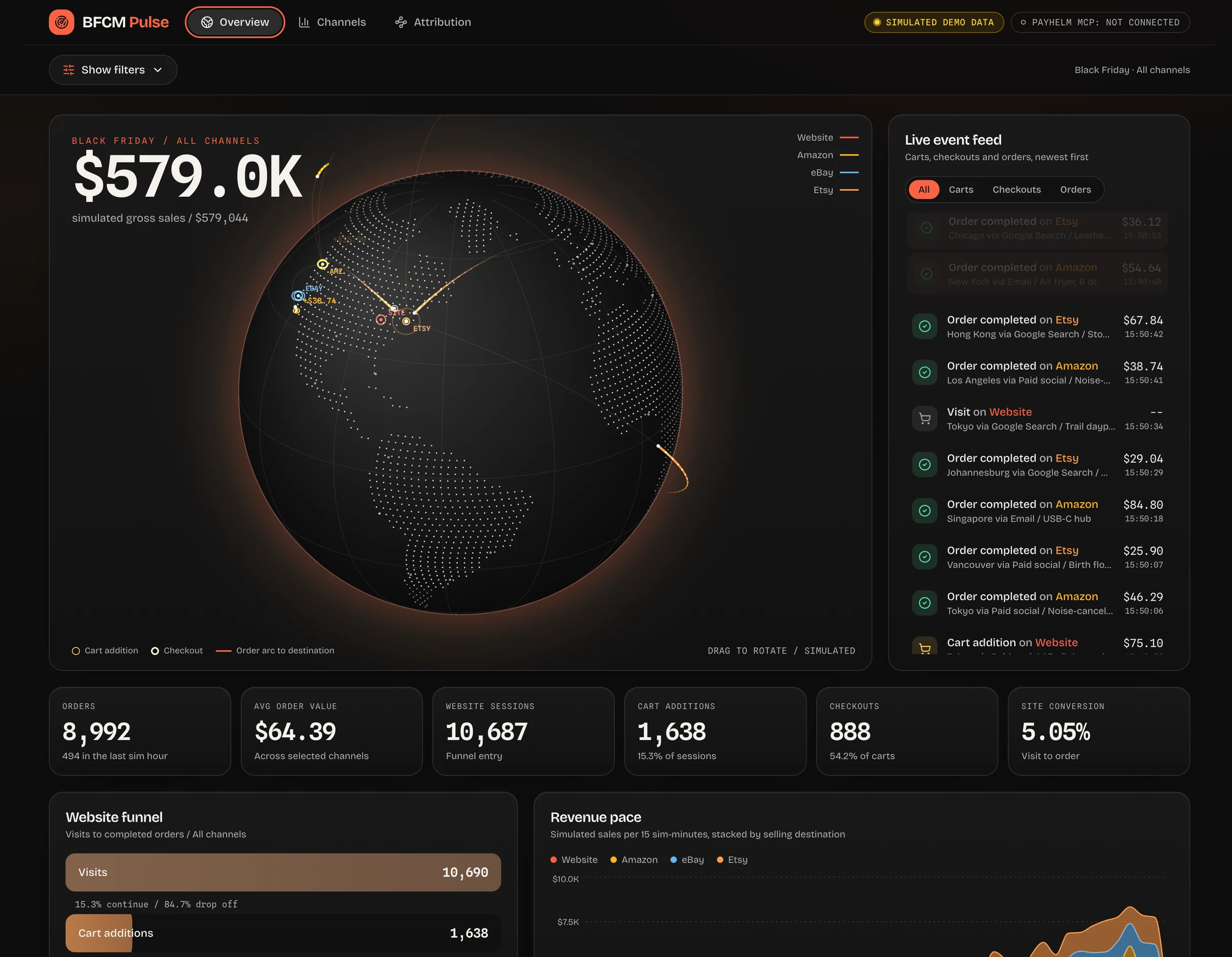
The overview screenshot pairs a large sales figure with a globe that maps simulated activity and order-to-destination paths. Beside it, the event feed distinguishes visits, cart additions, checkouts and completed orders so the page tells a story beyond a single counter. That visual treatment can help a team see the rhythm of a promotion, but it should never distract from the operational metrics underneath. The screenshot includes orders, average order value, website sessions, cart additions, checkouts and site conversion as separate cards. Its website funnel makes the movement from visits to carts and later stages easier to inspect when traffic rises but completed purchases do not. Its revenue-pace chart breaks simulated sales into short time intervals and stacks them by selling destination. In a connected implementation, request only a granularity the source supports and display the latest successful refresh rather than inventing a live event stream. The demo’s globe uses simulated locations, so real geographical markers should appear only where authorized source data provides appropriate location information. Keep website conversion tied to website visits and website orders, not every marketplace order divided by site sessions.
The pain it addresses: a wall of totals that cannot explain whether the issue is traffic, intent or checkout completion. The benefit: a visually engaging overview with enough context to direct the next investigation.
Build a BFCM overview using PayHelm MCP. First discover the available tools
and call create_analysis_plan and list_connected_platforms.
Use read-only reporting tools to populate revenue, orders, AOV and the
website funnel. Add an animated globe only if usable location data exists.
Keep website and marketplace denominators separate. Display data freshness,
metric definitions and explicit empty states. Do not invent events, locations
or results; keep a separate, clearly labeled demo mode.
Screenshot two: compare selling channels without hiding the differences
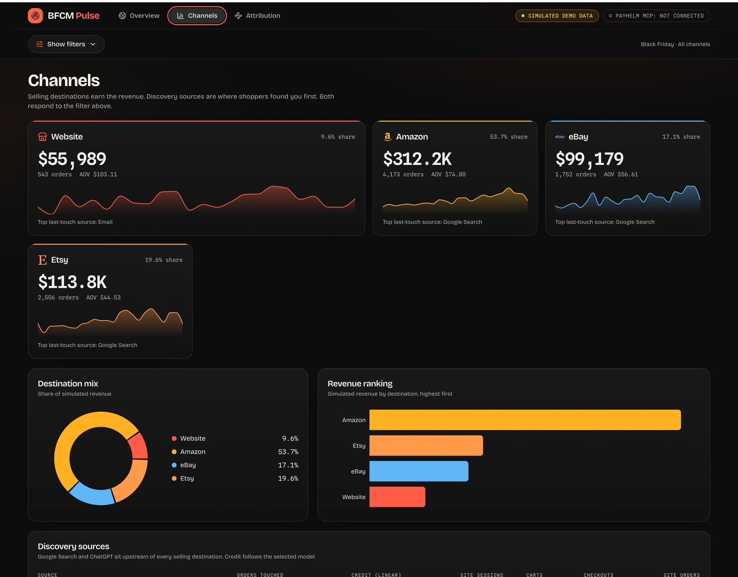
The Channels screenshot breaks the promotion into Website, Amazon, eBay and Etsy cards instead of burying everything in one total. Each card combines revenue, share, orders and AOV with a sparkline that shows movement during the selected period. The destination-mix chart makes concentration visible, while the horizontal revenue ranking gives people a quick way to compare the largest contributors. In this particular demo snapshot, Amazon represents 53.7% of simulated destination revenue, which illustrates the kind of channel dependency a merchant may want to inspect. That number is an example, not a claim about typical PayHelm customer performance or your own account. A strong connected version applies the same date range and channel selection to cards, ranking and mix so the comparisons stay aligned. If you sell through Walmart or another supported platform, add its card only after confirming that the connected account exposes the required reporting data. The demo also shows a top last-touch source per destination, but a real implementation should display that label only when a defensible source-to-order relationship is available. Separating selling destinations from discovery sources prevents the common mistake of comparing Amazon sales with Google Search as though they were the same type of channel.
The pain it addresses: one marketplace carrying the weekend while another quietly slows down. The benefit: faster channel-level investigation, without assuming that a revenue ranking alone is enough to justify changing ad budgets or stock allocations.
Create a Channels tab from available PayHelm reports. Show revenue,
orders, AOV and share for each connected selling destination.
Add accessible sparklines, a destination-mix chart and a revenue ranking.
Use one shared date/channel filter. Reconcile shares and totals.
Keep discovery sources separate from selling destinations, and show
an unknown-source state where reliable source-to-order links are missing.
Screenshot three: explain attribution instead of inventing certainty
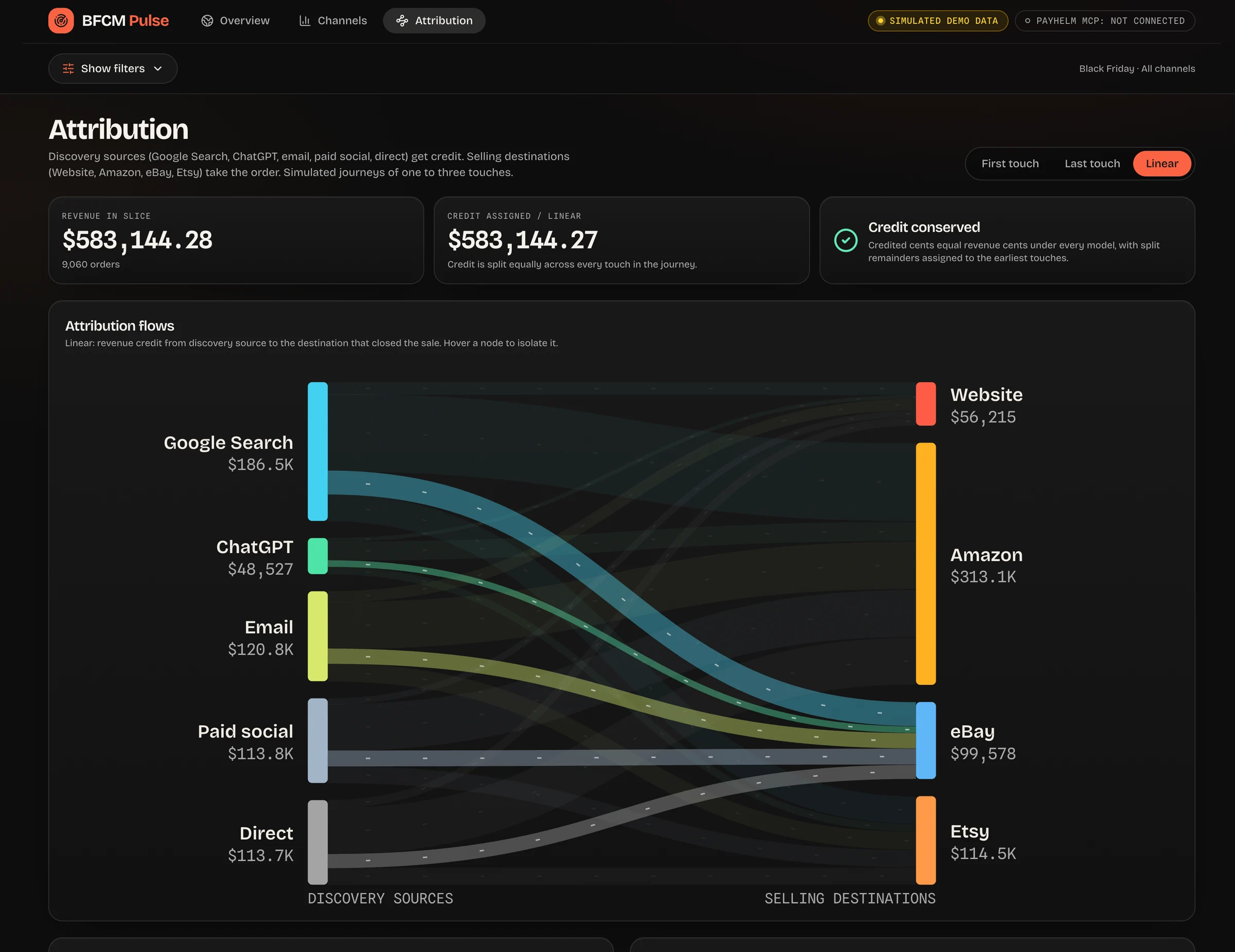
The attribution-flow screenshot places Google Search, ChatGPT, Email, Paid social and Direct on the discovery side of a Sankey-style diagram. Website, Amazon, eBay and Etsy appear on the selling-destination side, making the conceptual difference easy to understand. Its first-touch, last-touch and linear controls illustrate how the same eligible orders could receive different source credit under different rules. First touch credits the earliest recorded eligible touch, last touch credits the latest one, and a simple linear model divides credit across recorded eligible touches. PayHelm MCP can expose available reporting data, but it cannot manufacture identity links or recover touches that were never captured. Marketplace orders may lack a usable website journey, and a ChatGPT label is meaningful only when the available tracking actually identifies that source. If the discovered tools do not expose sufficiently linked journey records, show source and destination aggregates separately instead of drawing speculative paths. The captured linear view shows revenue of $583,144.28 and assigned credit of $583,144.27, a one-cent difference despite the demo’s “Credit conserved” badge. In a production version, calculate allocations in cents, apply a deterministic remainder rule and label credit reconciled only when it matches eligible revenue exactly.
The pain it addresses: an attractive attribution chart that hides missing data or encourages overconfidence. The benefit: a clearer explanation of model assumptions, coverage and rounding before anyone acts on the result.
Inspect whether PayHelm's discovered read-only tools return genuine,
linked journey records. If they do, build first-touch, last-touch and
linear views over the same eligible orders. Include unattributed orders,
coverage and model definitions. Reconcile revenue credit in integer cents.
If linked journeys are unavailable, do not invent them: show independent
source and destination aggregates and explain what additional data is needed.
Screenshot four: turn model comparisons into better questions
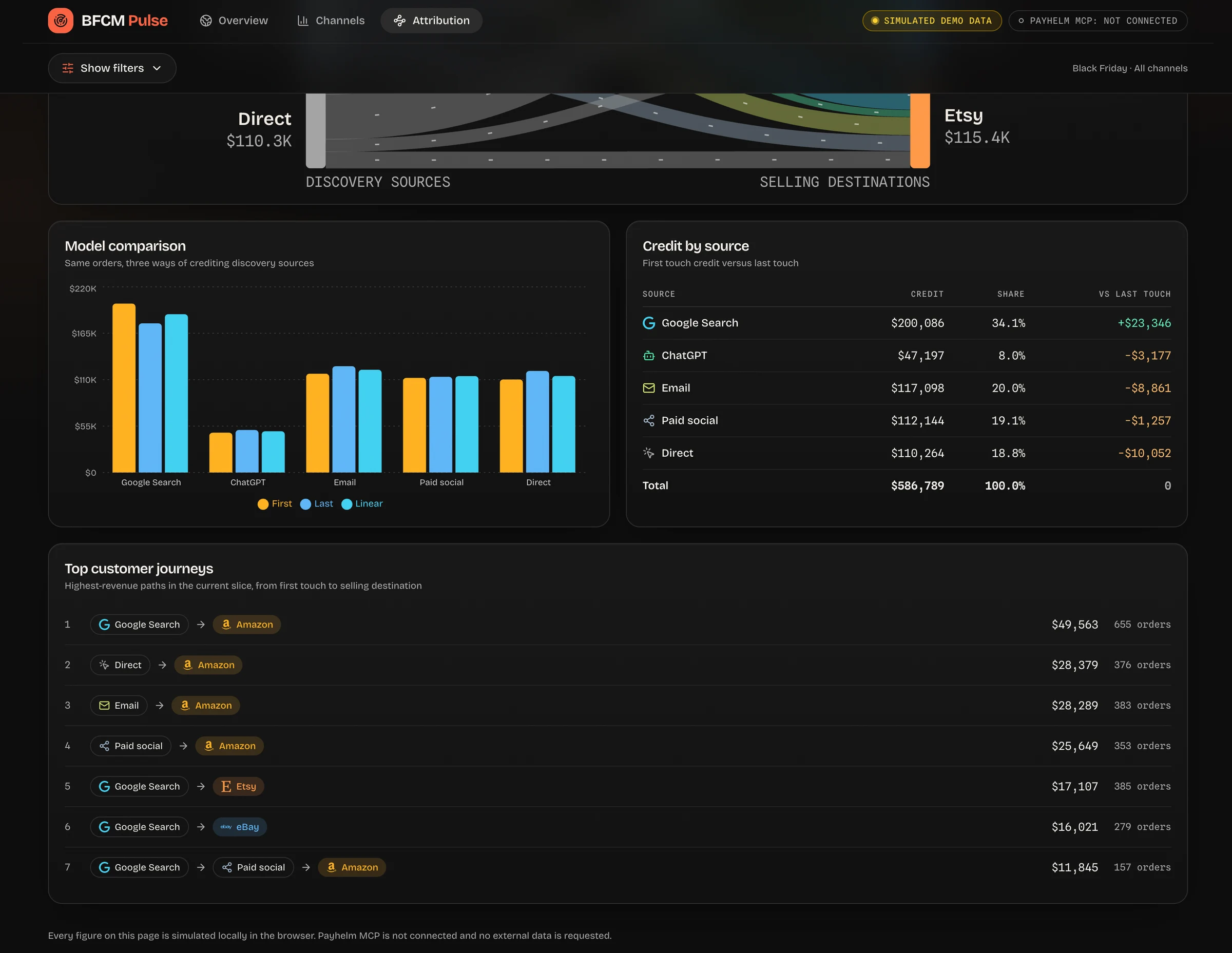
The final screenshot adds a model-comparison chart, a credit-by-source table and a ranked list of simulated customer journeys. The grouped bars put first-touch, last-touch and linear credit beside one another, making it easier to see which sources depend on the chosen rule. The table translates that visual difference into credited revenue, share and a change versus last touch. Its Google Search row shows $200,086 of illustrative credit and a positive $23,346 difference versus last touch in that captured view. Those values demonstrate the interface, not an independently verified marketing return or a recommendation to increase spending. The journey list makes the example concrete with paths such as Google Search → Amazon and Email → Amazon, plus associated orders and revenue. In a real build, include only paths the data actually supports and avoid exposing individual customer identities in a shared dashboard. A model difference is a reason to investigate how credit is assigned, not proof that one source caused incremental revenue. Keep the population of eligible orders fixed across models so an apparent improvement is not just a change in which orders were included.
The pain it addresses: teams arguing over attribution totals without understanding why the totals differ. The benefit: a shared explanation of the accounting rules, a clear set of limitations and more focused questions for follow-up analysis.
Use a precise build prompt, then validate before BFCM
A useful dashboard prompt includes the reporting window, timezone, connected accounts and metric definitions before it describes the visual style. For a US 2026 promotion, Black Friday is November 27 and Cyber Monday is November 30, but your campaign window may begin earlier or run longer. Compare equivalent promotion windows rather than assuming the same calendar dates create a fair year-over-year comparison. Ask for three linked views—Overview, Channels and Attribution—with shared filters, clear labels and keyboard-accessible controls. Use the MCP planning and discovery steps to identify what can be built from the available data before committing to a layout. Keep credentials server-side and choose a refresh schedule that respects supported source update intervals and tool limits. Validate order counts, revenue totals, channel shares and attribution coverage against the underlying PayHelm reports, including refund and timezone edge cases. Test mobile layouts, loading states and connection failures so the page remains useful during the busiest part of the weekend. When a requested metric cannot be supported, a clear missing-data explanation is more valuable than a confident synthetic number presented as reality.
Help me build a custom BFCM dashboard using the PayHelm Analytics & Data
Platform and PayHelm MCP. Start by discovering current tools and schemas,
listing connected platforms and creating an analysis plan.

Use November 27–30, 2026 as an example window; confirm my actual campaign
dates, reporting timezone, currency and gross/net sales definitions first.
Build Overview, Channels and Attribution tabs with shared filters.
Use read-only tools for revenue trends, orders, channel breakdowns,
products/SKUs and website funnel metrics where available.

Use a striking dark dashboard style with restrained motion, readable cards,
accessible chart alternatives and a reduced-motion option.
Keep all API credentials on a secured server, not in browser code.
Show last refresh, data-source labels, empty/error states and metric definitions.
Offer multi-touch views only if real linked journey records exist; otherwise
explain the gap. Never silently substitute demo data for connected results.
Reconcile financial totals and model credit, test the interface on mobile,
and ask for approval before any operation that changes stores or ad accounts.
Start with the PayHelm MCP setup guide, connect your channels in PayHelm, and use the Analytics & Data Platform as the reporting foundation. The goal is not simply a dashboard that looks impressive in a screenshot: it is a dashboard your team can understand, verify and use throughout BFCM.