How to Use PayHelm to Steer Your Ecommerce Success

Now more than ever, being intelligent about your ecommerce business means getting up close and personal with business intelligence. Business intelligence (BI for short) leverages software and services to transform your data into actionable insights, i.e., the info you need to succeed.
Nobody does that better than PayHelm. Why? Two words: Totally customizable. If you have a BigCommerce, Shopify, and/or WooCommerce store — or stores! — PayHelm provides an unparalleled array of analytics that can be tailored to your business like a bespoke suit, yielding richly detailed reports that will help your ecommerce enterprise grow and thrive.
You can be up and running in just five simple steps:
- Go to PayHelm.com; sign up via BigCommerce, Google, PayPal, or Shopify; and install the PayHelm app
- Agree to PayHelm’s Terms & Conditions
- Wait a minute while your store data (transaction history) uploads to PayHelm
- While you’re waiting, link additional sales channels
- Your new PayHelm Analytics Dashboard is ready to go!
Business intelligence literally makes you more intelligent about your business. That’s where PayHelm comes in: It crunches data about your products, your sales, and your customers across multiple BigCommerce, Shopify, and/or WooCommerce accounts and even across multiple platforms, including eBay and Walmart.
With PayHelm, you’ll really get to know your numbers. PayHelm will tell you which of your products are performing best and who your key customers are. Furthermore, PayHelm will reveal what marketing campaigns are making you the most money.
In addition, you can drill down into any aspect of your data to answer crucial questions and verify assumptions. PayHelm’s reports are so accurate, your finance team may not have to change a thing! And PayHelm covers your business worldwide.
Here are just a few of the sales reports you can create for your BigCommerce, Shopify, or WooCommerce Store:
- Analyze
product lines by
- Total sales
- Orders
- Average price
- Selling fees
- Product cost
- Gross margin
- Profit
- And more!
- Filter sales data by time frames and compare performance
- Get granular and check all product performance by keyword
- Parse product sales by variant, SKU, or brand
- Filter or create reports based on product details such as size, model, mix, etc.
- Who purchases the most?
- Which customers drive the most profits?
- See trends in a single customer’s purchasing behavior over the past five years
You can do a deeper dive into any aspect of your customers’ data as well.
PayHelm is your new best friend when tax time rolls around, too. See what you’ve paid in taxes by country or state. PayHelm will also reveal which of your products are most profitable given any tax rate.
Moreover, you can chart tax trends over time for any customer, customer group, marketing campaign, or custom data tag. Shopify storeowners can even compare shipping address/state vs billing address/state.
All of this meticulously dissected data is literally at your fingertips — only a few clicks away — thanks to PayHelm’s intuitive user interface. Like the Time Warp from Rocky Horror Picture Show, it’s just a jump to the left, then a step to the right:
When you “open” (i.e., log into) your Big Commerce, Shopify, or WooCommerce store, scroll down to Apps in the left-hand sidebar, then click on the PayHelm icon to launch the app and display your PayHelm dashboard.
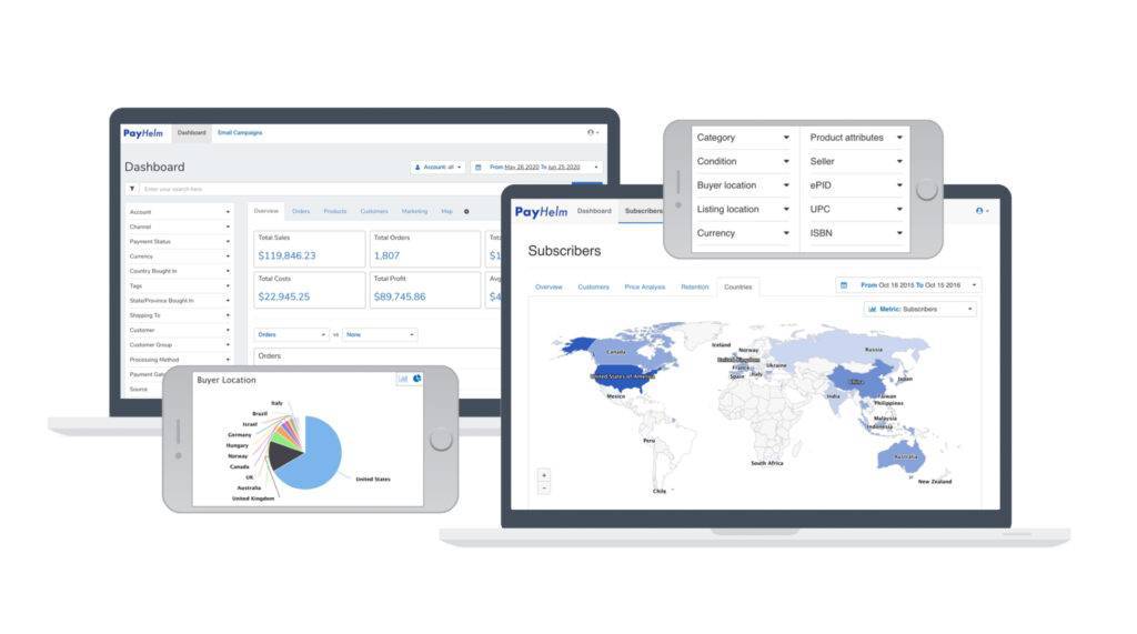
Next, step to the right, into your dashboard. There, the Overview screen gives you a macro, well, overview of your business.
Then jump to the left again, where PayHelm’s vertical navigation bar features expandable menus covering everything from Account to Vendor, including:
- Account Channel
- Payment Status
- Country/Region Bought In
- State/Province Bought In
- Country/Region Shipped To
- Customer
- Customer Group
- Processing Method
- Payment
- Gateway
- Source
- Fulfillment Status
- Brand
- SKU
- Vendor
- Product Type
- Category
- Tax Exempt Category
- Product Options
- Size
- Color
Back to those steps to the right: Navigate from Overview to Orders (a list of your customers) to Products (sales breakdown by item) to Customers (micro-looks at each individual’s purchase history) to Marketing (campaigns) to Map (an actual zoomable map of where you’re selling to along with a table of metrics that even details your fulfillment times!).
Speaking of time, you can quantify that any which way your business heart desires: today or yesterday; this week or last week; this month or last month; this quarter or last quarter; the last 7, 14, 30, 90, or 365 days; or last year.
Click on the little gear icon to change your dashboard’s settings. This is where you get to specify just how far you want to drill down (Report Columns); exactly how granular you need to get (Metrics and Filters); and precisely how you prefer your data to be displayed (Column? Pie chart? Table?).
Finally, you can export the whole shebang to a CSV file at any point along the way.
We could go into even more detail about PayHelm’s wonderfully nuanced analyses, but that would spoil the fun of letting you click around and discover its analytical superpowers for yourself (and your business). If you get bogged down at any point, or just want to discuss some fine points, PayHelm’s customer support team has got your back — around the clock and around the world.
Here’s the kicker: If you find yourself needing BI beyond what’s currently offered, PayHelm’s savvy and customer-centric developers will listen to your request, then code it into the app for you PDQ.